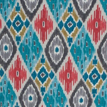
Fashionable colour in ikat fabrics in 2020 – variety of shades, colour combination
Dec
In 2020, there will be no simplicity in the colour range of ikat fabrics:
The pressed rose, Iriska, some dark shades of green – at first glance, return us to autumn. But it is impossible to deny their refined charm!
One of the leaders of the season is yellow, or rather its shades: golden aspen, turmeric, lemon. Yellow is the cheerful color of unisex, it is best able to “warm up” the cold shades of the coming summer.
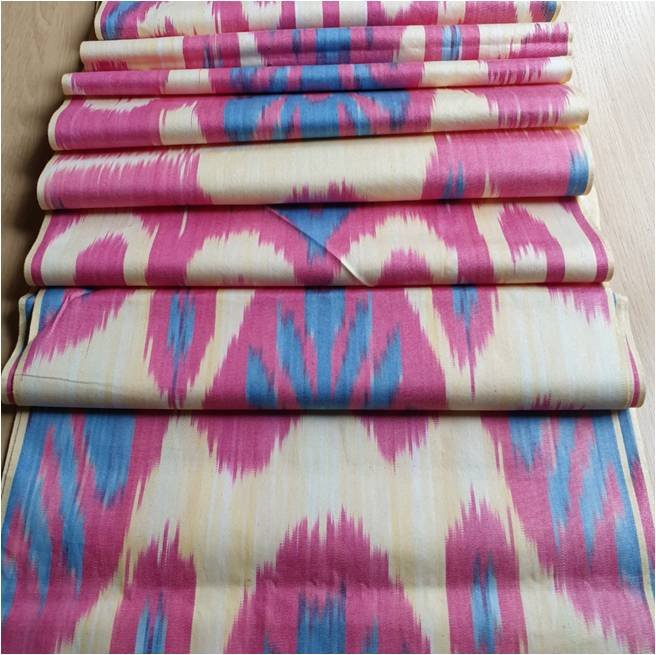
Another palette of shades will lead next season. These are various pink tones, including purple-pink and coral.
What colors of ikat will be in fashion in 2020 – the best choice of the year, photo review
1. Ballet pink. A sophisticated shade that goes well with any trendy color of the summer season. Designers used it literally in everything: from outerwear to elegant evening dresses.

2. Pressed rose. Light as air – this shade is the best embodiment of femininity. Luxurious, slightly cold, but incredibly sophisticated – it will be a cult on all the podiums of next year.
3. Sweet lilac. A pale pink hue of lavender, feminine but not too sweet. It was actively used in an elegant minimalist design. The ikat fabric of this color is unusually delicate and beautiful, and can be used in sewing clothes and fashion accessories.

4. Coral. Bright shade between orange and pink. It will be an adornment of any wardrobe. Of all the color trends this year, coral is the most suitable for the summer season. It is a color reminiscent of fruit drinks, beautiful flowers and tropical relaxation.

5. Pink peacock. Intense purple color. It is simply impossible to ignore. This is one of the most striking color trends – the shade is so noticeable that few would dare to wear it as the main one. But in combination with neutral colors, it turns into a suitable option for any image.
6. Fiesta. It is a true summer color with lots of fire. A passionate, exciting trend that can truly charm anyone and become your favorite color. It is partially used in ikat fabric and clearly harmonizes with other shades of fabric.
7. Turmeric. A yellow-orange hue, which is worth paying special attention to when choosing a summer wardrobe. It is especially well combined with brown, red and even blue paints. Turmeric-colored outerwear or a delicate fabric dress with shades of this color will be the perfect embodiment of spring.

8. Lemon Verbena. Yellow led the way on the world’s podiums, and lemon verbena is the softest hue in this palette. He is unobtrusive and “tasty.” In ikat fabric, this color is very well combined with black and white colors in unusual patterns.

9. The Golden Aspen. Compared to lemon verbena, golden aspen has a deeper yellow color with a barely noticeable orange tint. It is more balanced and can be better combined with red shades such as coral or fiesta. The sunniest color of next summer. Of course, it is present in many ikat tissues, especially in the atlas.
10. Green moss. The most dualistic color. Green moss is a natural, deep shade reminiscent of the coolness of the forest. It goes well with all floral prints.
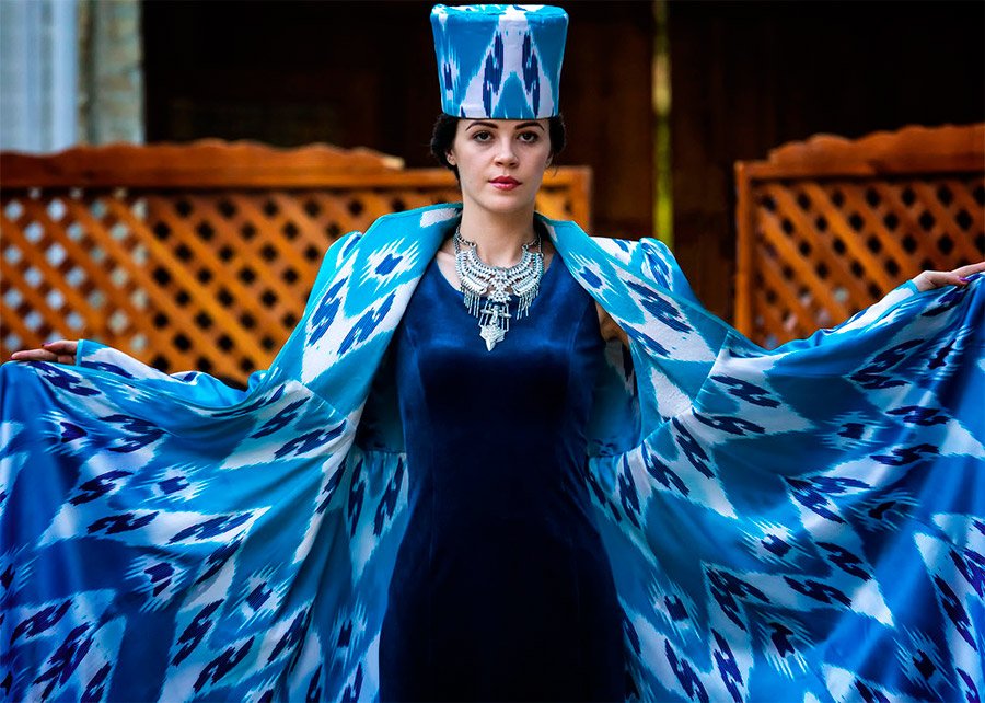
11. Blue for the princess. Color, associated with calm, confident luxury. This is one of the coldest shades in the fashionable palette, but its splendor did not leave anyone indifferent. Turmeric and Lemon Verbena are especially effective in complementing blue and retaining its brightness.
12. Iriska. Warm color that goes well with most skin types. Combined with brighter reds and yellows, it looks more like an autumn color palette.
13. The eclipse. Dark blue color, as close as possible to black. Many considered it a mysterious trend of the coming spring. Fashion House Dior advises using this shade in ikat jackets and suits.

Pressed rose. Light as air – this shade is the best embodiment of femininity. Luxurious, slightly cold, but incredibly sophisticated – it will be a cult on all the podiums of next year.Sweet lilac. A pale pink hue of lavender, feminine but not too sweet. It was actively used in an elegant minimalist design. The ikat fabric of this color is unusually delicate and beautiful, and can be used in sewing clothes and fashion accessories.Coral. Bright shade between orange and pink. It will be an adornment of any wardrobe. Of all the color trends this year, coral is the most suitable for the summer season. It is a color reminiscent of fruit drinks, beautiful flowers and tropical relaxation.Pink peacock. Intense purple color. It is simply impossible to ignore. This is one of the most striking color trends – the shade is so noticeable that few would dare to wear it as the main one. But in combination with neutral colors, it turns into a suitable option for any image.Fiesta. It is a true summer color with lots of fire. A passionate, exciting trend that can truly charm anyone and become your favorite color. It is partially used in ikat fabric and clearly harmonizes with other shades of fabric.Turmeric. A yellow-orange hue, which is worth paying special attention to when choosing a summer wardrobe. It is especially well combined with brown, red and even blue paints. Turmeric-colored outerwear or a delicate fabric dress with shades of this color will be the perfect embodiment of spring.Lemon Verbena. Yellow led the way on the world’s podiums, and lemon verbena is the softest hue in this palette. He is unobtrusive and “tasty.” In ikat fabric, this color is very well combined with black and white colors in unusual patterns.The Golden Aspen. Compared to lemon verbena, golden aspen has a deeper yellow color with a barely noticeable orange tint. It is more balanced and can be better combined with red shades such as coral or fiesta. The sunniest color of next summer. Of course, it is present in many ikat tissues, especially in the atlas.Green moss. The most dualistic color. Green moss is a natural, deep shade reminiscent of the coolness of the forest. It goes well with all floral prints.Blue for the princess. Color, associated with calm, confident luxury. This is one of the coldest shades in the fashionable palette, but its splendor did not leave anyone indifferent. Turmeric and Lemon Verbena are especially effective in complementing blue and retaining its brightness.Iriska. Warm color that goes well with most skin types. Combined with brighter reds and yellows, it looks more like an autumn color palette.The eclipse. Dark blue color, as close as possible to black. Many considered it a mysterious trend of the coming spring. Fashion House Dior advises using this shade in ikat jackets and suits.